
【WordPress】ブログカード プラグイン無し自作カスタマイズでSEO対策
オリジナルのブログカードを作る

記事内に「リンク」を、沢山置いていますか
WordPressブログサイトの投稿記事内で「他の記事へのリンク」(ブログカードやリンクカードといいます)を沢山設定していますか?
様々な記事を見てもらうために、記事を内部リンクで繋げていくのは、SEO対策的に有効です。
一つの記事だけ読んで、サイトから離れてしまうことを直帰率と言いますが、それを下げられて、滞在時間が長くなるからです。
今回はブログカードをプラグインなしで、レスポンシブ対応で2パターンのカスタマイズをしていきます。
*プラグインを使うと、サイト表示が重くなるので避けたいと思います
「オリジナルブログカード」と、「WPデフォルトブログカードのカスタマイズ」2種類を紹介。
それぞれ3工程で試せますので、自分の好きなタイプを使ってみて下さい!
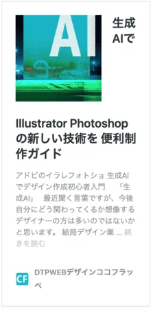
1、パターン1 オリジナルデザインで作成する
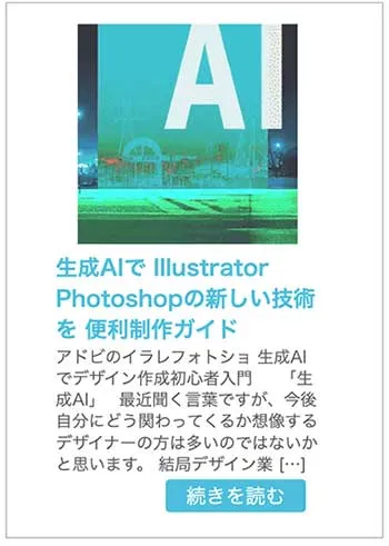
出来上がりはこのような形です

画像サムネイルの横に、タイトルと抜粋文、続きを読むのボタンを設定します
① ブログカードを作成するショートコードを設定
下記のコードを「functions.php」に記述します。
//ブログカード
// 記事IDを指定して抜粋文を取得
function ltl_get_the_excerpt($post_id){
  global $post;
  $post_bu = $post;
  $post = get_post($post_id);
  setup_postdata($post_id);
  $output = get_the_excerpt();
  $post = $post_bu;
  return $output;
}

//サイト内部リンクをブログカードに変換するショートコード
function nlink_scode($atts) {
	extract(shortcode_atts(array(
		'url'=>"",
		'title'=>"",
		'excerpt'=>""
	),$atts));

	$id = url_to_postid($url);//URLから投稿IDを取得

	$img_width ="160";//画像サイズ幅指定
	$img_height = "160";//画像サイズ高さ指定
	$no_image = 'http://xn--ockl7gh3i3b.com/wp-content/uploads/2016/07/8206ef08e3589c9361e6a7c8e637f208-1.png';//アイキャッチ画像が無い時の画像指定

    //タイトル取得
	if(empty($title)){
		$title = esc_html(get_the_title($id));
	}
    //抜粋文取得
	if(empty($excerpt)){
		$excerpt = esc_html(ltl_get_the_excerpt($id));
	}

    //アイキャッチ画像取得
    if(has_post_thumbnail($id)) {
        $img = wp_get_attachment_image_src(get_post_thumbnail_id($id),array($img_width,$img_height));
        $img_tag = "<img src='" . $img[0] . "' alt='{$title}' width=" . $img[1] . " height=" . $img[2] . " />";
    }else{
    $img_tag ='<img src="'.$no_image.'" alt="" width="'.$img_width.'" height="'.$img_height.'" />';
    }

	$nlink .='
  <div class="blog-card">
    <a href="'. $url .'">
    <div class="blog-card-area">
      <div class="blog-card-thumbnail">'. $img_tag .'</div>
      <div class="blog-card-content">
          <div class="blog-card-textarea">
          <div class="blog-card-title">'. $title .' </div>
          <div class="blog-card-excerpt">'. $excerpt .'</div>
          </div>
          <div class="blog-card-next"></div>
      </div>
      </div>
      </a>
  </div>';

	return $nlink;
}

add_shortcode("nlink", "nlink_scode");
// ブログカード終わり
*function.phpはミスでサイト表示がエラーになる事がある為バックアップを取って作業して下さい
② デザインをCSSで設定
スマートフォン表示では縦に並ぶようにCSSで指定します
CSSの設定は、コードをstyle.cssの一番下に追加してください。
*スマホ表示は、下部メディアクエリでデザインに合わせて調整して下さい
/*ブログカード*/
.blog-card {
    border: 1px solid #b1b1b1;
    word-wrap: break-word;
    margin-right: 15px;
    margin-top: 10px;
    margin-bottom: 10px;
}

.blog-card-area {
    display: -webkit-flexbox;
    display: -ms-flexbox;
    display: flex;
    flex-wrap: nowrap;
    justify-content: space-between;
    margin-right: 10px;
}

.blog-card a {
    text-decoration: none;
}

.blog-card:hover {
    opacity: 0.8;
}

.blog-card-title {
    color: #25afd5;
    display: block;
}

.blog-card-thumbnail {
    flex-basis: 25%;
    padding: 10px;
}

.blog-card-thumbnail img {
    padding: 0;
    -webkit-transition: 0.3s ease-in-out;
    -moz-transition: 0.3s ease-in-out;
    -o-transition: 0.3s ease-in-out;
    transition: 0.3s ease-in-out;
}

.blog-card-content {
    flex-basis: 73%;
    display: flex;
    flex-direction: column;
    justify-content: space-between;
    line-height: 120%;
}

.blog-card-textarea {
    display: flex;
    flex-direction: column;
}

.blog-card-title {
    padding: 10px 10px 10px 0;
    font-size: 1em;
    font-weight: bold;
    line-height: 1.5em;
}

.blog-card-excerpt {
    font-size: 0.75em;
    color: #333;
    margin: 0 5px 5px;
    line-height: 1.3em;
}

.blog-card-next {
    text-align: right;
    margin-right: 10px;
    margin-bottom: 20px;
}

.blog-card-next:after {
    background: #25afd5;
    color: white;
    padding: 5px 15px 5px 15px;
    content: "続きを読む";
    font-size: 0.9em;
    border-radius: 3px;
}

/* レスポンシブ対応 */
@media screen and (max-width: 400px) {
    .blog-card {
        margin: 1px;
    }

    .blog-card-area {
        display: -webkit-flexbox;
        display: -ms-flexbox;
        display: flex;
        flex-wrap: wrap;
        justify-content: center;
        margin-top: 15px;
    }

    .blog-card-thumbnail {
        flex-basis: auto;
        padding: 0;
    }

    .blog-card-title {
        padding: 0 0 1px 0;
        font-size: 1em;
        font-weight: bold;
        line-height: 1.4em;
    }

    .blog-card-excerpt {
        font-size: 0.75em;
        color: #333;
        margin: 0;
        line-height: 1.3em;
    }

    .blog-card-next {
        text-align: right;
        margin: 5px 10px 20px 0;
    }
}
③ショートコードの使い方
ブログカードの表示は、投稿記事の挿入したい所にショートコードを記述します。
*画像ですので打って下さい

これでパターン1は完成です。CSSを変更することで、サイズやカラーを変更してみて下さい!
2、パターン2 WordPressデフォルトのブログカードをカスタマイズ
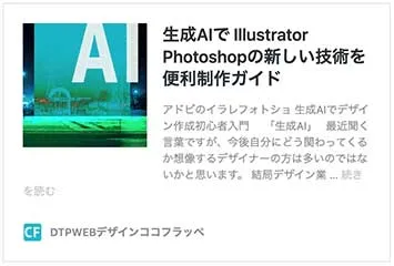
パソコン表示とスマホ表示、元々のWPのデフォルトブログカードはこの様な仕様でした。
スマホ表示では、タイトルがサムネイルの横に並んでしまい、更に途中で改行されて、おかしな表示となっています。
*デフォルトでコメントアイコンとシェアアイコンが表示される場合があります
*デフォルトでサイトアイコンが表示されない場合もあります
① functions.php に記述
デザインの指定のための「wp-embed-template.css」を読み込むための加筆です。
*「wp-embed-template.css」は③で作成します
function custom_embed_style() {
wp_enqueue_style('wp-embed-template-org', get_stylesheet_directory_uri() . '/wp-embed-template.css');
}
add_filter('embed_head', 'custom_embed_style');
② embed-content.php を複製し内容を変更する
サムネイルを大きくして上に表示、タイトルと抜粋文章が下になる様、縦並びレイアウトにカスタムします。
コメントアイコンとシェアアイコンはいらないので、コメントアウトします。
複製し内容変更した方を、有効化しているテーマフォルダ直下にアップロードします。
*子テーマがある場合は子テーマに
<div <?php post_class( 'wp-embed' ); ?>>
<?php
$thumbnail_id = 0;


if ( has_post_thumbnail() ) {
$thumbnail_id = get_post_thumbnail_id();
}


if ( 'attachment' === get_post_type() && wp_attachment_is_image() ) {
$thumbnail_id = get_the_ID();
}


$thumbnail_id = apply_filters( 'embed_thumbnail_id', $thumbnail_id );


if ( $thumbnail_id ) {
$aspect_ratio = 1;
$measurements = array( 1, 1 );
$image_size = 'full'; // Fallback.


$meta = wp_get_attachment_metadata( $thumbnail_id );
if ( ! empty( $meta['sizes'] ) ) {
foreach ( $meta['sizes'] as $size => $data ) {
if ( $data['height'] > 0 && $data['width'] / $data['height'] > $aspect_ratio ) {
$aspect_ratio = $data['width'] / $data['height'];
$measurements = array( $data['width'], $data['height'] );
$image_size = $size;
}
}
}


$image_size = apply_filters( 'embed_thumbnail_image_size', $image_size, $thumbnail_id );


$shape = $measurements[0] / $measurements[1] >= 1.75 ? 'rectangular' : 'square';


$shape = apply_filters( 'embed_thumbnail_image_shape', $shape, $thumbnail_id );
}


if ( $thumbnail_id && 'rectangular' === $shape ) :
?>
<div class="wp-embed-featured-image rectangular">
<a href="<?php the_permalink(); ?>" target="_top">
<?php echo wp_get_attachment_image( $thumbnail_id, $image_size ); ?>
</a>
</div>
<?php endif; ?>


<?php if ( $thumbnail_id && 'square' === $shape ) : ?>
<div class="wp-embed-featured-image square">
<a href="<?php the_permalink(); ?>" target="_top">
<?php echo wp_get_attachment_image( $thumbnail_id, $image_size ); ?>
</a>
</div>
<?php endif; ?>


<p class="wp-embed-heading">
<a href="<?php the_permalink(); ?>" target="_top"><?php the_title(); ?></a>
</p>


<div class="wp-embed-excerpt"><?php the_excerpt_embed(); ?></div>


<?php
do_action( 'embed_content' );
?>


<div class="wp-embed-footer">
<?php the_embed_site_title(); ?>
</div>
</div>
<?php
③ デザインをカスタマイズ
デフォルトで崩れていたスマホ表示をきちんと縦並びにレイアウトします。
wp-embed-template.css を作成しコードを記載します。
*ファイル名は必ずwp-embed-template.cssとして下さい
/wp-contents/themes/現在有効化されている子テーマ/wp-embed-template.css
テーマ直下にアップロードします。
※子テーマの場合は子テーマフォルダ直下
.wp-embed {
    padding: 12px;
}

.wp-embed a:hover {
    color: #ababab;
}

.wp-embed-featured-image img {
    object-fit: cover;
    width: 180px;
    height: 180px;
}

.wp-embed-featured-image.square {
    float: left;
    max-width: 180px;
    margin-right: 20px;
}

p.wp-embed-heading {
    font-size: 1.1rem;
    margin: 0 0 15px;
    padding: 0 0 10px;
    border-bottom: 1px dotted #32332f;
    display: -webkit-box;
    -webkit-box-orient: vertical;
    -webkit-line-clamp: 3;
    overflow: hidden;
}

.wp-embed-heading a:hover {
    text-decoration: none;
}

.wp-embed-site-icon {
    width: 20px;
    height: 20px;
}

.wp-embed-site-title a {
    padding-left: 24px;
    font-size: 0.9rem;
}

.wp-embed-site-title a:hover {
    text-decoration: none;
}

.wp-embed-excerpt {
    display: -webkit-box;
    -webkit-box-orient: vertical;
    -webkit-line-clamp: unset;
    overflow: unset;
    margin-bottom: 20px;
}

.wp-embed-footer {
    margin-top: 5px;
}

.wp-embed-meta {
    display: none;
}

@media screen and (max-width: 420px) {
    .wp-embed-featured-image.square {
        float: none;
        width: 100%;
        max-width: 100%;
        margin-right: 0;
    }

    .wp-embed-featured-image img {
        object-fit: cover;
        width: 100%;
        height: auto;
    }
}
3、まとめ
ブログカード、リンクカードはブログには必須の機能です。
ブログカードを使うようになってからは、直帰率は減少傾向なりました。
プラグインなしでサイトにも負担が無いので訪問者に親切なUIデザインを目指すことが結果SEO効果をもたらします。

マッチングサイトに先生登録しませんか!?

ココフラッペ公式LINE
LINEで簡単にお申し込み・お問い合わせ・レッスン予約ができます。
ぜひお気軽にご参加ください。